It turns out that the fonts in LMDE look a bit different to those in say Ubuntu. This is partly because of Ubuntu's theme, and partly because Debian's font rendering is a little dated. There is a guy over at http://www.infinality.net/blog/ who has made some patches to the font renderer (freetype and fontconfig) which haven't yet been picked up by Debian. I installed these patches and it made quite a difference to some text in Firefox.
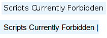
Notice how the text in the upper half has the C and u in "Currently" touching, and each letter is quite skinny. While in the lower half of the image which I took after installing infinalty, the letters are better spaced, and a bit denser.
This is how I did it:
sudo apt-get install devscripts quilt

cd /tmp

wget https://github.com/chenxiaolong/Debian-Packages/archive/master.zip

unzip master.zip

cd Debian-Packages-master

cd fontconfig-infinality

./build.sh

cd ../freetype-infinality

./build.sh

cd ..

sudo dpkg -i *.deb